⚡ The Reality Check
“Users judge your code by your interface.”
You could write the most efficient sorting algorithm in the world, but if the button is misaligned and the font is ugly, users will think your software is “buggy” or “cheap.”
We have spent this week building apps: a Task Manager, a Unit Converter, and an Image Resizer.
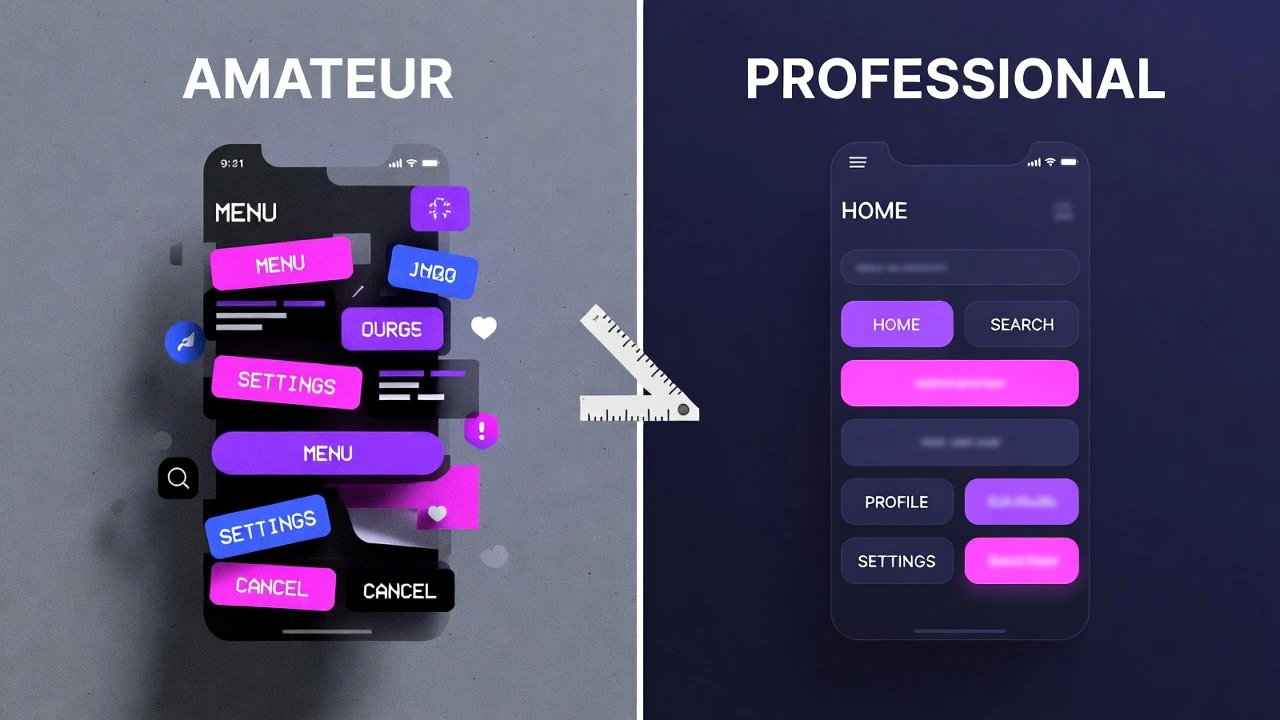
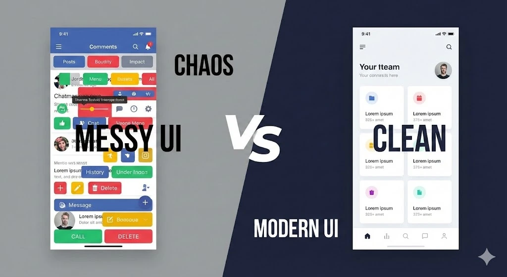
But making an app work is different from making it look good. Beginners often create apps that look cluttered and confusing. Today, we are covering the 5 design rules that separate “Amateur Scripts” from “Professional Software.”
Rule #1: Alignment is Everything 📐
The human eye loves order. When elements are slightly off-center, it creates subconscious stress.
The Mistake: Using place(x=50, y=100) and guessing the coordinates. This leads to buttons that are “floating” in random spots.
The Fix: Use a Grid System. Imagine your window is a spreadsheet. Every button should live in a specific row and column.
- Align labels to the Left (West).
- Align buttons to the Center or Fill the width.
Rule #2: The Power of Whitespace ☁️
Beginners are terrified of empty space. They try to cram every widget into the top-left corner.
The Mistake: Elements touching the edge of the window.
The Fix: Give your widgets room to breathe. In CustomTkinter, use padx and pady generously.
# Bad
button.pack()

# Good (20 pixels of breathing room)
button.pack(padx=20, pady=20)
Rule #3: Consistency is King 👑
The Mistake: Using three different font sizes, four different button colors, and mixing round and square corners.
The Fix: Pick a “Design System” and stick to it.
- Fonts: Use ONE font family (e.g., Arial or Roboto). Use Large for Titles, Medium for Buttons, Small for Labels.
- Widths: Make all your main buttons the same width (e.g.,
width=200), even if the text inside them is different lengths.
Rule #4: The Feedback Loop ⏳
A user should never have to guess, “Is it working?”
The Mistake: The app freezes while processing data (like we saw in our initial Image Resizer attempts).
The Fix: Always provide visual feedback.
- If a task takes < 1 second, change the button text to “Done!”.
- If a task takes > 1 second, use a Progress Bar or a spinner.
- If an error occurs, show a red error label, don’t just print to the console (where the user can’t see it).
Rule #5: Color Theory (Dark Mode Done Right) 🌑
The Mistake: Using pure black (#000000) background with neon green text. This causes eye strain (halatian effect).
The Fix: Professional “Dark Mode” is actually Dark Gray.
- Background: Dark Gray (e.g.,
#2b2b2b). - Surface (Cards): Slightly lighter Gray.
- Accent: One main color (Blue or Green) for the primary action button.
(Luckily, CustomTkinter handles this for you automatically if you set the theme to “System”!)
Conclusion
Design is not about being an artist. It is about being organized, consistent, and considerate of your user.
Now that you know how to make an app work and look good, you are ready for the final boss.
Tomorrow: We wrap up GUI Week by building the ultimate project: a Modern YouTube Video Downloader. It will combine everything we’ve learned: input validation, real-time feedback, threading, and a sleek dark-mode UI.