⚡ Why Go Interactive?
- The Problem: Static images (JPG/PNG) don’t let you see the details. You can’t zoom in or check specific numbers.
- The Solution: Plotly creates HTML charts. They work like mini-apps in your browser.
- The Feature: You can zoom, pan, hover for tooltips, and even animate data over time.
You send a chart to your boss. Five minutes later, they reply: “This looks great, but what is that exact number for March? It’s hard to tell.”
So you go back to Excel, find the number, and email it back. It’s annoying.
What if you could send a chart where your boss could just hover their mouse over the bar to see the number? What if they could zoom in on a specific week? Today, we are building exactly that using Plotly.
The Toolkit 🧰
We need to install Plotly and Pandas. Open your terminal:
pip install plotly pandasWe will use a module called Plotly Express (px). It is designed to create complex interactive charts in just one line of code.
Step 1: The Data (Gapminder) 🌍
To show off the power of interaction, we need a rich dataset. We will use the famous “Gapminder” dataset, which tracks Life Expectancy and GDP for countries over the last 50 years.
Plotly has this built-in, so we don’t even need to download a file!
import plotly.express as px

# Load built-in data
df = px.data.gapminder()

# Let's see what it looks like
print(df.head())
Step 2: The Interactive Bubble Chart 🔵
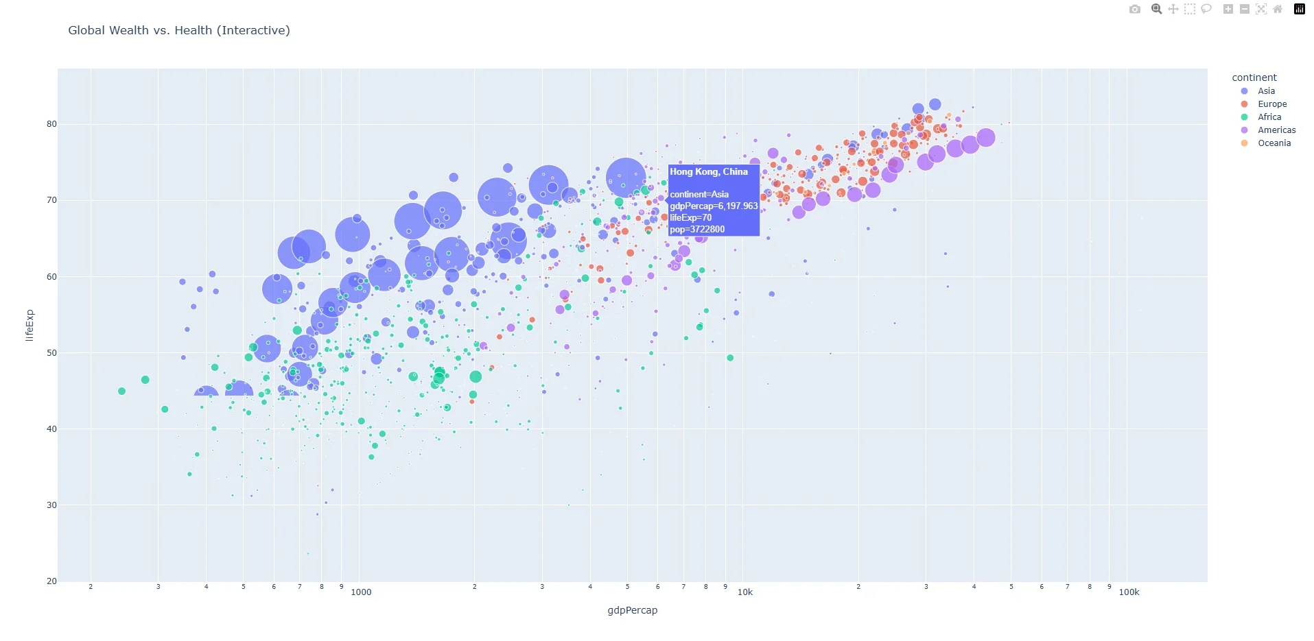
We are going to visualize the relationship between wealth (GDP) and health (Life Expectancy).
Create a file named dashboard.py and add this code:
import plotly.express as px

df = px.data.gapminder()

# Create the Interactive Scatter Plot
fig = px.scatter(df,
                 x="gdpPercap",
                 y="lifeExp",
                 size="pop",        # Bubble size = Population
                 color="continent", # Bubble color = Continent
                 hover_name="country", # Tooltip title
                 log_x=True,        # Use log scale for better visibility
                 size_max=60,
                 title="Global Wealth vs. Health (Interactive)"
                 )

# Show the chart in your browser
fig.show()
Run this script. A new tab will open in your web browser. Try hovering over the bubbles—you will see the exact country name and stats pop up!
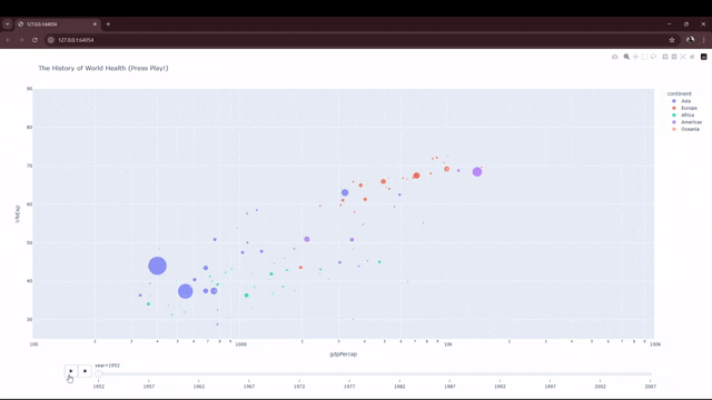
Step 3: Adding “Time Travel” Animation ⏳
Right now, the chart is messy because it shows every year at once. Let’s fix that.
We will add an animation slider so we can watch the world change from 1952 to 2007. We only need to add one parameter: animation_frame.
import plotly.express as px

df = px.data.gapminder()

fig = px.scatter(df,
                 x="gdpPercap",
                 y="lifeExp",
                 animation_frame="year", # <-- THE MAGIC PART
                 animation_group="country",
                 size="pop",
                 color="continent",
                 hover_name="country",
                 log_x=True,
                 size_max=55,
                 range_x=[100,100000],
                 range_y=[25,90],
                 title="The History of World Health (Press Play!)"
                 )

fig.show()
Look at the bottom of the chart. You now have a “Play” button and a timeline slider. Click Play and watch the countries grow and move!
Step 4: Saving as a Shareable File 💾
This is the coolest part. You can save this entire interactive experience as a single HTML file. You can email this file to a colleague, and they can open it in Chrome without installing Python.
Add this line to the end of your script:
fig.write_html("my_dashboard.html")
print("Dashboard saved! You can now open 'my_dashboard.html' in any browser.")
Next Steps
You have moved from static images to interactive HTML applications.
But creating charts is only half the battle. You also need to know what creates bad charts. Tomorrow, we are going to do something different. We will look at the “7 Deadly Sins of Data Visualization” to make sure your beautiful charts don’t lie.
Frequently Asked Questions
Is Plotly free?
Yes! The open-source version of Plotly (which we used today) is 100% free for personal and commercial use.
Can I embed this on my website?
Yes. Since the output is just HTML code, you can embed it into any WordPress site or dashboard using an iframe or a code block.
Why is the file size large?
Plotly embeds the JavaScript library inside the HTML file so it works offline. This makes the file around 3MB, which is still small enough to email.