⚡ What You Will Build
- The Data: Live stock prices (Apple, Tesla, Bitcoin) from Yahoo Finance.
- The Viz: An interactive “Candlestick Chart” used by professional traders.
- The Tool:
yfinancefor data +plotlyfor the dashboard.
Welcome to the finale of Data Visualization Week.
We have learned how to make charts beautiful and interactive. Now, let’s make them real. Today, we are building a dashboard that pulls live stock market data from the internet and visualizes it instantly.
The Toolkit 🧰
We need a new library called yfinance. It is the most popular way to get free stock data in Python.
pip install yfinance plotly pandasStep 1: Get the Live Data 📡
First, let’s see how easy it is to grab the price of Apple (AAPL).
import yfinance as yf
# 1. Define the Ticker (Symbol)
ticker = "AAPL"
# 2. Download data for the last year
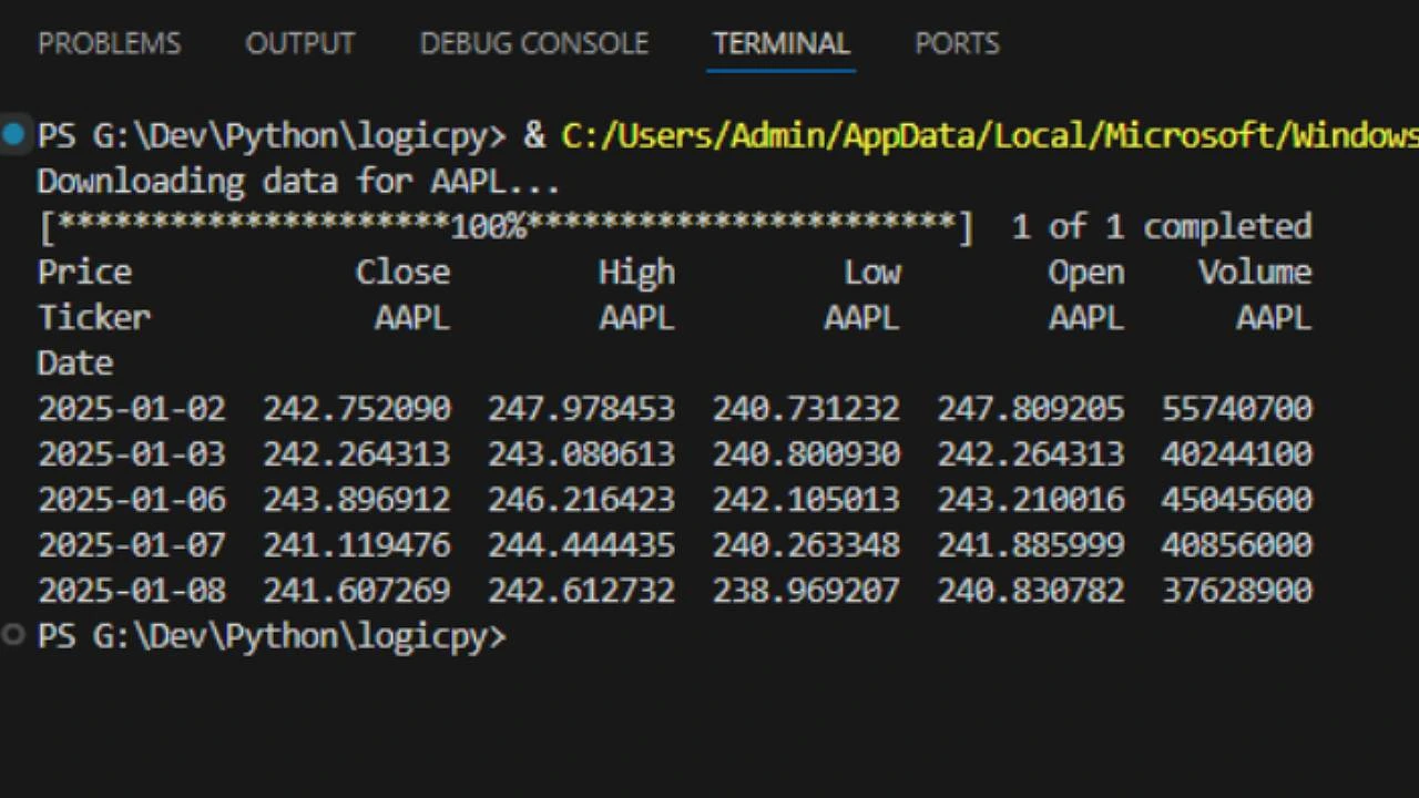
print(f"Downloading data for {ticker}...")
data = yf.download(ticker, period="1y")
# 3. Inspect it
print(data.head())
Run this. You should see a table printed in your terminal with columns like Open, High, Low, and Close. This is exactly what we need.
Step 2: The Candlestick Chart 🕯️
Traders don’t use line charts. They use Candlestick Charts because they show more detail (the high and low price of the day).
Plotly has a built-in tool just for this.
import plotly.graph_objects as go

# Create the chart
fig = go.Figure(data=[go.Candlestick(x=data.index,
                open=data['Open'],
                high=data['High'],
                low=data['Low'],
                close=data['Close'])])

# Add a title
fig.update_layout(title=f'Price Chart for {ticker} (1 Year)')

fig.show()
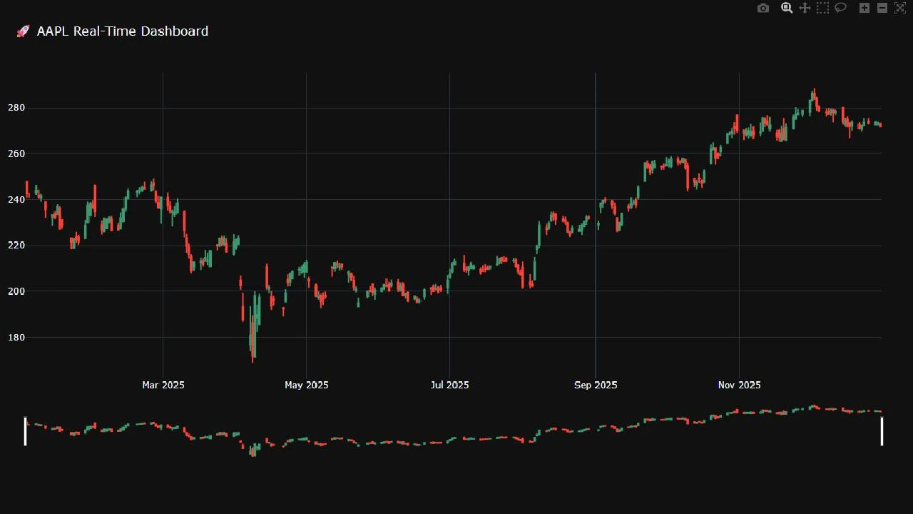
Run this. You now have a professional trading chart. You can zoom in on specific days, and the red/green bars show if the stock went up or down.
Step 3: Adding the “Range Slider” 🎚️
Let’s make it look like a real fintech app. We will add a slider at the bottom so users can scroll through time.
Update your layout code:
fig.update_layout(
    title=f'{ticker} Stock Price Dashboard',
    yaxis_title=f'{ticker} Price (USD)',
    xaxis_rangeslider_visible=True  # <-- This adds the slider
)
fig.show()
Step 4: The Final Dashboard Script 🚀
Let’s put it all together into a script that asks the user “Which stock do you want to see?” and then builds the dashboard for them.
import yfinance as yf
import plotly.graph_objects as go

def create_dashboard():
    # 1. Ask the user for a ticker
    symbol = input("Enter Stock Symbol (e.g., AAPL, TSLA, BTC-USD): ").upper()

    # 2. Download Data using the safer .history() method
    print(f"Fetching data for {symbol}...")
    try:
        # Use Ticker object which returns a cleaner dataframe
        stock = yf.Ticker(symbol)
        data = stock.history(period="1y")

        # Check if data is empty
        if data.empty:
            print("Error: No data found. Did you type the symbol correctly?")
            return

        # 3. Create Chart
        # Note: We use data.index for dates, and access columns directly
        fig = go.Figure(data=[go.Candlestick(
                        x=data.index,
                        open=data['Open'],
                        high=data['High'],
                        low=data['Low'],
                        close=data['Close'],
                        name=symbol)])

        # 4. Style it
        fig.update_layout(
            title=f'🚀 {symbol} Real-Time Dashboard',
            yaxis_title='Price (USD)',
            xaxis_rangeslider_visible=True,
            template="plotly_dark", # Dark mode for that "Hacker" look
            height=700
        )

        fig.show()
        print("Dashboard loaded successfully! Check your browser.")

    except Exception as e:
        print(f"An error occurred: {e}")

if __name__ == "__main__":
    create_dashboard()
Output:
What’s Next?
You have just built a tool that:
- Takes user input.
- Connects to a live financial API.
- Visualizes complex data interactively.
This wraps up Data Visualization Week! Next week, we are going to pivot to something very popular right now: “Web Scraping Week.” We will learn how to extract data from websites that don’t have APIs.