⚡ Quick Summary
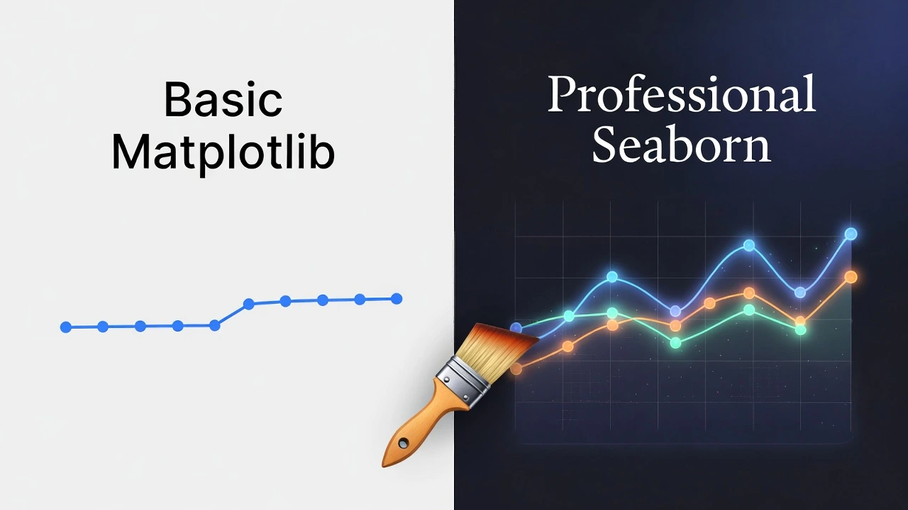
- The Problem: Default Python charts (Matplotlib) look outdated and boring.
- The Fix: Seaborn is a library that adds professional styles, colors, and themes instantly.
- The Effort: It often takes just one extra line of code to see a massive improvement.
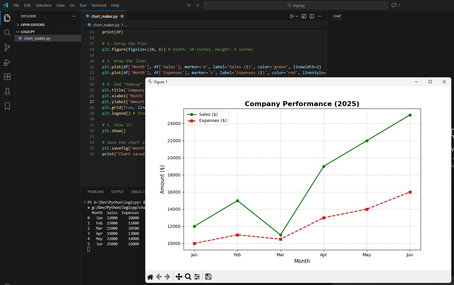
Yesterday, we learned how to turn Excel sheets into charts using Python. The result was accurate, but let’s be honest: it looked a bit… “scientific.” It certainly didn’t look like something you’d see on the front page of a major newspaper.
If you want your charts to look professional, modern, and “startup-ready,” you don’t need a degree in graphic design. You just need Seaborn.
The Toolkit 🧰
Seaborn is built on top of Matplotlib, acting as a “theme engine.” Let’s install it:
pip install seabornStep 1: The Instant One-Line Upgrade ⚡
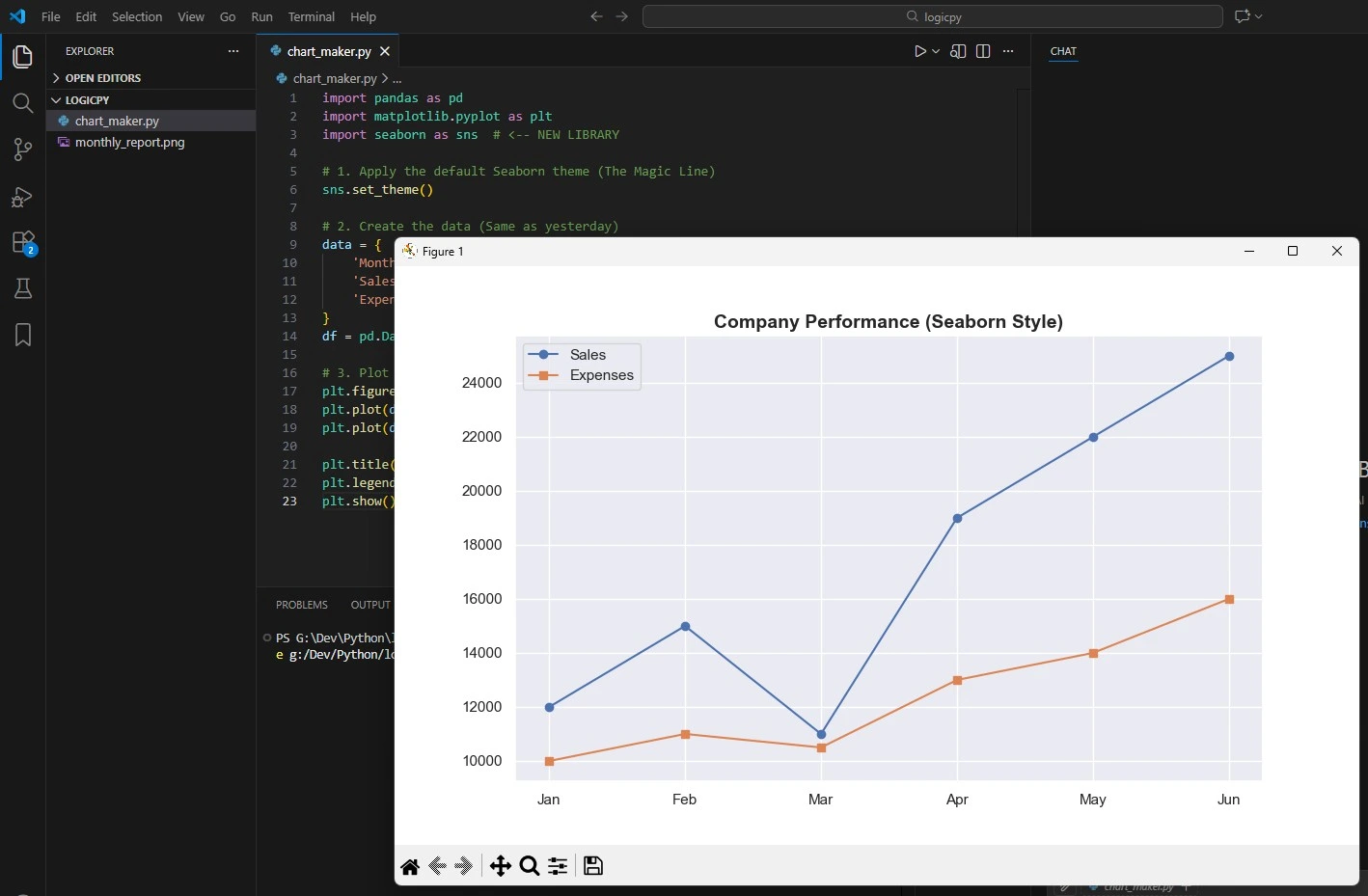
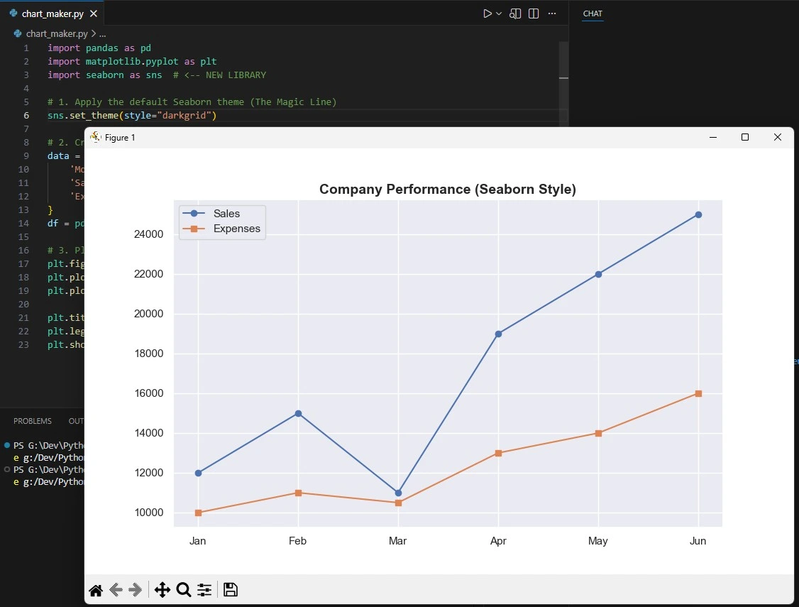
Open your script from yesterday. We are going to make it look 10x better by adding just two lines.
import pandas as pd
import matplotlib.pyplot as plt
import seaborn as sns  # <-- NEW LIBRARY

# 1. Apply the default Seaborn theme (The Magic Line)
sns.set_theme()

# 2. Create the data (Same as yesterday)
data = {
    'Month': ['Jan', 'Feb', 'Mar', 'Apr', 'May', 'Jun'],
    'Sales': [12000, 15000, 11000, 19000, 22000, 25000],
    'Expenses': [10000, 11000, 10500, 13000, 14000, 16000]
}
df = pd.DataFrame(data)

# 3. Plot it (Seaborn handles the styling automatically)
plt.figure(figsize=(10, 6))
plt.plot(df['Month'], df['Sales'], marker='o', label='Sales')
plt.plot(df['Month'], df['Expenses'], marker='s', label='Expenses')

plt.title('Company Performance (Seaborn Style)', fontsize=14, fontweight='bold')
plt.legend()
plt.show()
Run this code. Notice the difference? The font is cleaner, the colors are softer, and the gridlines are subtle. It instantly looks more polished.
Now:
Before:
Step 2: Going “Dark Mode” 🌙
Dark mode dashboards are everywhere. Seaborn makes this incredibly easy.
Change the theme line to this:
sns.set_theme(style="darkgrid")Now, when you run the chart, it has a professional gray background with white gridlines, making the data pop. This style is perfect for financial presentations or slides.
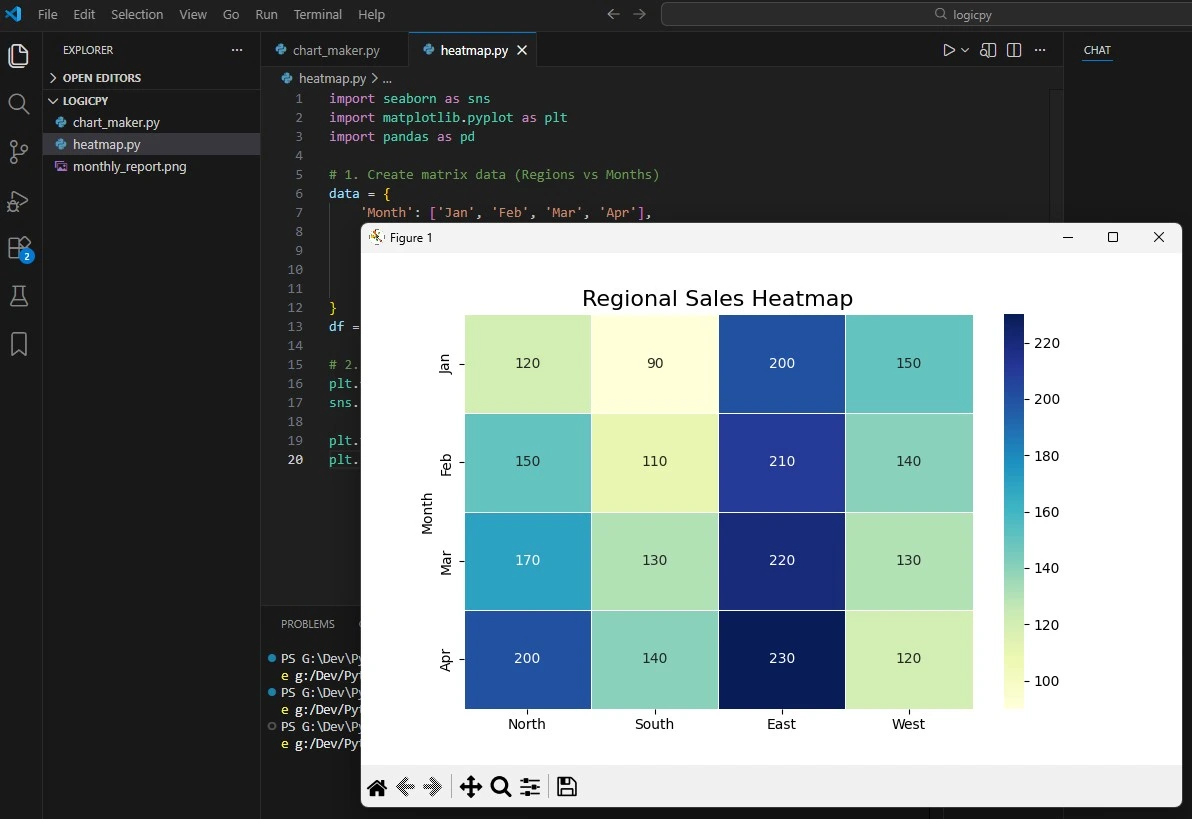
Step 3: Bonus Chart – The Heatmap 🔥
Line charts are great, but Seaborn is famous for Heatmaps. A heatmap uses color intensity to show numbers, which is perfect for spotting trends instantly.
Let’s visualize sales across different regions. Create a new file called heatmap.py:
import seaborn as sns
import matplotlib.pyplot as plt
import pandas as pd

# 1. Create matrix data (Regions vs Months)
data = {
    'Month': ['Jan', 'Feb', 'Mar', 'Apr'],
    'North': [120, 150, 170, 200],
    'South': [90, 110, 130, 140],
    'East':  [200, 210, 220, 230],
    'West':  [150, 140, 130, 120]
}
df = pd.DataFrame(data).set_index('Month')

# 2. Create the Heatmap
plt.figure(figsize=(8, 6))
sns.heatmap(df, annot=True, fmt="d", cmap="YlGnBu", linewidths=.5)

plt.title('Regional Sales Heatmap', fontsize=16)
plt.show()
What’s happening here?
annot=True: Writes the actual numbers inside the boxes.cmap="YlGnBu": Sets the color palette (Yellow-Green-Blue).linewidths=.5: Adds crisp white lines between the boxes.
Next Steps
You have now mastered static charts. You can make them accurate (Pandas) and beautiful (Seaborn).
But there is one problem: they are just images. You can’t zoom in, hover over a point to see the exact number, or filter the data.
Tomorrow, we change that. We are going to build **Interactive Dashboards** using **Plotly**. Get ready to build charts that your users can actually play with.
Frequently Asked Questions
Do I still need Matplotlib?
Yes. Seaborn is built on top of Matplotlib. Think of Matplotlib as the engine and Seaborn as the paint job. You often use Matplotlib commands (like plt.title) to tweak Seaborn charts.
Can I use my own brand colors?
Absolutely. You can create a custom palette using sns.set_palette(["#FF5733", "#33FF57"]) to match your company branding exactly.
Where can I find more styles?
Seaborn comes with 5 preset themes: darkgrid, whitegrid, dark, white, and ticks. Try them all to see which one fits your project best!